Technical
This version of the Off Canvas pattern works by using negative margins and changing class names with JavaScript. Transition effects are accomplished using css3 transitions. I'll go over the basic style concepts below.
A Responsible Start
In order to ensure users can get to all the content when JavaScript is disabled, we'll have a .no-js class on the html element and then replace that class with .js via jQuery JavaScript. Our default styles for all three panels can be declared first. I'm leaving out any vendor prefixes for brevity.
[role="navigation"],
[role="main"],
[role="complementary"] {
	transition: .2s all ease;
	width: 90%;
	padding: 5%;
}
If JavaScript is detected, declare our layout styles for each panel with the navigation to the left and the sidebar content to the right.
.js [role="navigation"] {
	margin-left: -100%;
	float: left;
}
.js [role="main"] {
	margin-left: 0;
	float: left;
}
.js [role="complementary"] {
	margin-right: -200%;
	float: left;
}

Note: For some reason the the margin-right: -200%; declaration on .js [role="complementary"] makes for a smoother transition in WebKit and Gecko. If anybody knows why, let me know. You can basically declare anything for it though. I just wanted the transitions to look nice.
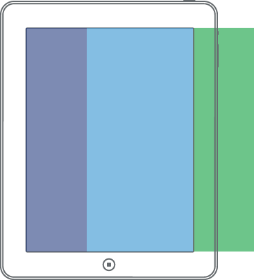
Access Left
For this demo, I'm using the left panel as navigation. We'll need an anchor element that will default to jump down the page to the #nav id. To get this to open the panel, we'll use a bit of jQuery to prevent default plus add a class to the body when clicked. Let's take a look at the panel styles for when the navigation is open.
.active-nav [role="navigation"] {
	margin-left: 0;
	width: 80%;
}
.active-nav [role="main"]{
	margin-right: -100%;
}
.active-nav [role="complementary"] {
	margin-right: -100%;
	float: right;
}

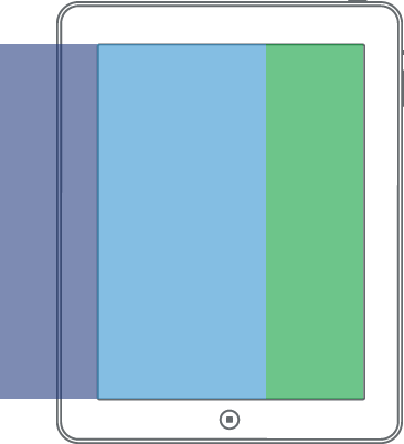
Access Right
Now we take the same concept to the other side for the hidden sidebar panel. We'll use slightly different styles.
.active-sidebar [role="navigation"] {
	margin-left: -100%;
}
.active-sidebar [role="main"] {
	margin-left: -90%;
}
.active-sidebar [role="complementary"] {
	margin-left: 0;
	width: 80%;
}
Medium Viewport Styles
For medium size viewports, we'll have the navigation panel show by default and hide the sidebar.
@media all and (min-width: 600px) {
	.js [role="navigation"] {
		width: 20%;
		margin-left: 0;
	}
	.js [role="main"] {
		width: 60%;
		float: left;
	}
	.js [role="complementary"] {
		width: 20%;
	}
	.active-sidebar [role="navigation"] {
		margin-left: -100%;
	}
	.active-sidebar [role="main"] {
		margin-left: 0;
		width: 60%;
	}
	.active-sidebar [role="complementary"] {
		margin-right: -80%;
		width: 20%;
	}
}
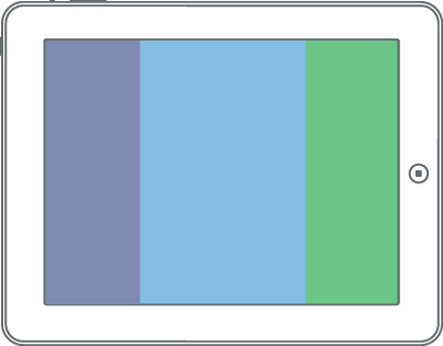
Large Viewport Styles
For large size viewports, we'll show all panels.
@media all and (min-width: 800px) {
	.js [role="navigation"] {
		width: 19%;
		margin-left: 0;
		float: left;
		padding: 3%
	}

	.js [role="main"] {
		width: 44%;
		padding: 3%;
	}

	.js [role="complementary"] {
		width: 19%;
		padding: 3%;
		margin-right: 0;
		float: right;
	}
}