A Multi-Device Web Layout Pattern

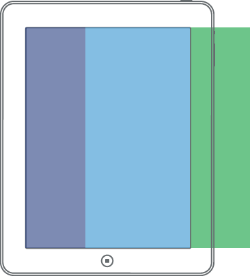
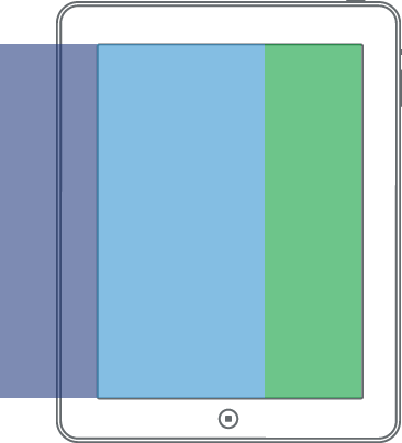
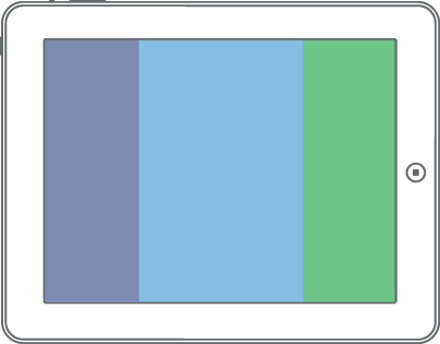
Inspired by the observations of Luke Wroblewski, this Off Canvas layout demo has 3 panels that display differently depending on the viewport width. The idea here is to have the two supporting panels of navigation and sidebar content hidden just off-screen to the left and right for easy access on small/medium viewports. Off Canvas is a design pattern, not a plugin or framework.

Mobile-First styles centered by default.
small screen center layout
Mobile-First styles for access to the left.
small screen left layout
Mobile-First styles for access to the right.
small screen right layout
Medium viewport screen styles showing left and main panel by default.
medium screen default layout
Medium viewport screen styles for access to the right.
small screen right layout
Large viewport screen styles showing all panels by default.
large screen default layout